Best Resume Format: One Column or Two Column Resume Format?
Should you use a one column resume or a two column resume template?
Recruiters often make split-second YES or NO decisions on your resume based on how easy it is to scan to find key information.
That's why choosing the correct resume format is so very important.
When you create a resume, you need to decide if you want a two column resume or a one column resume format.
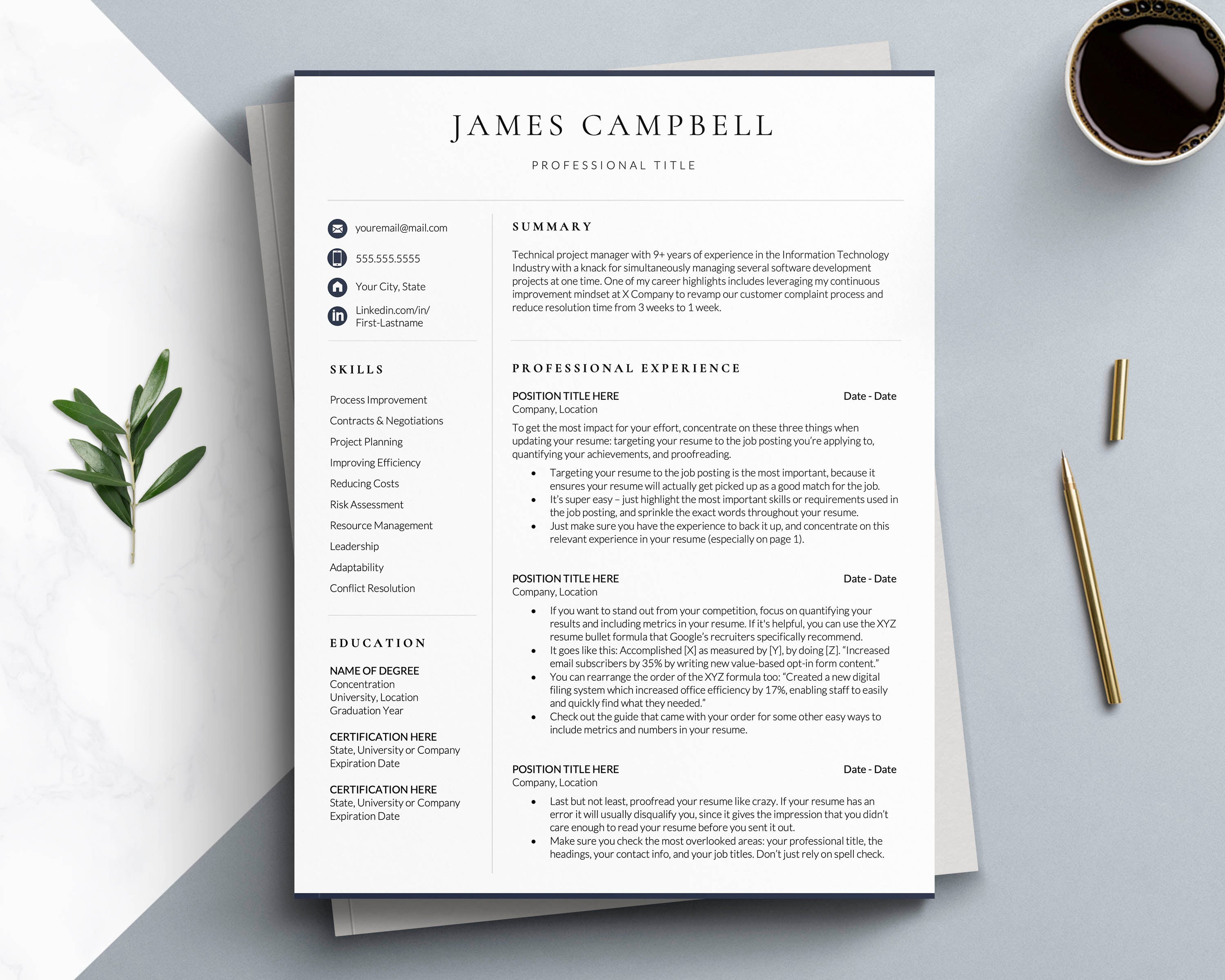
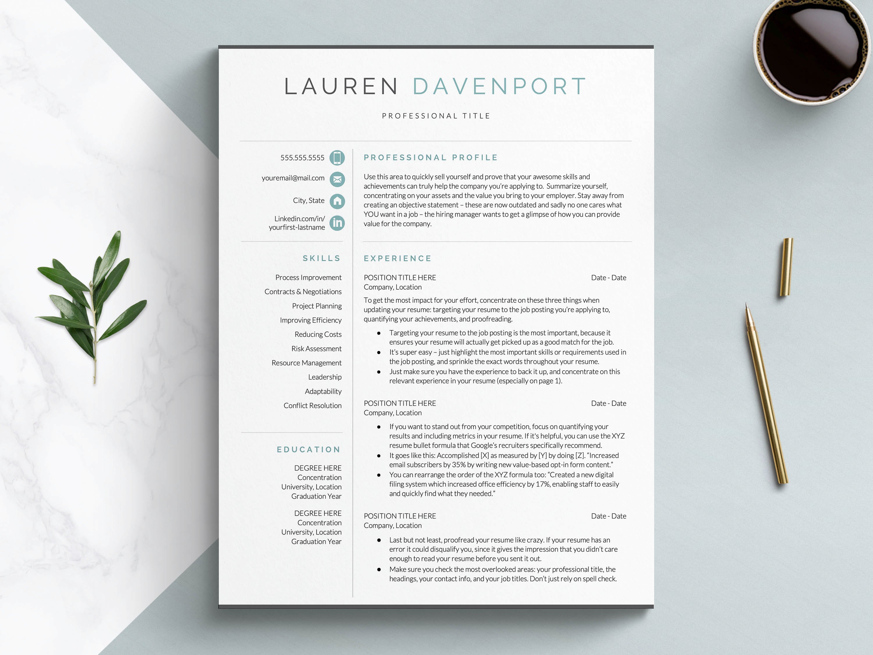
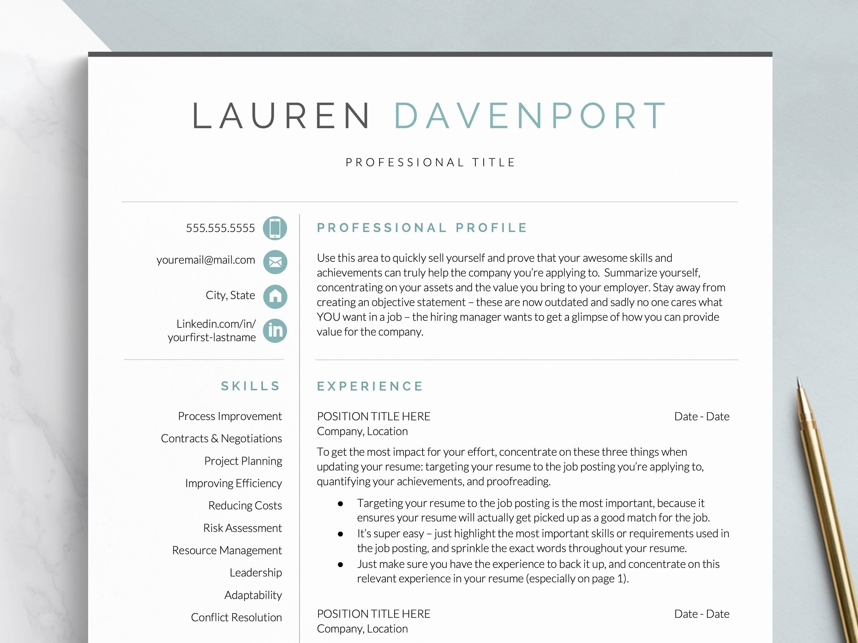
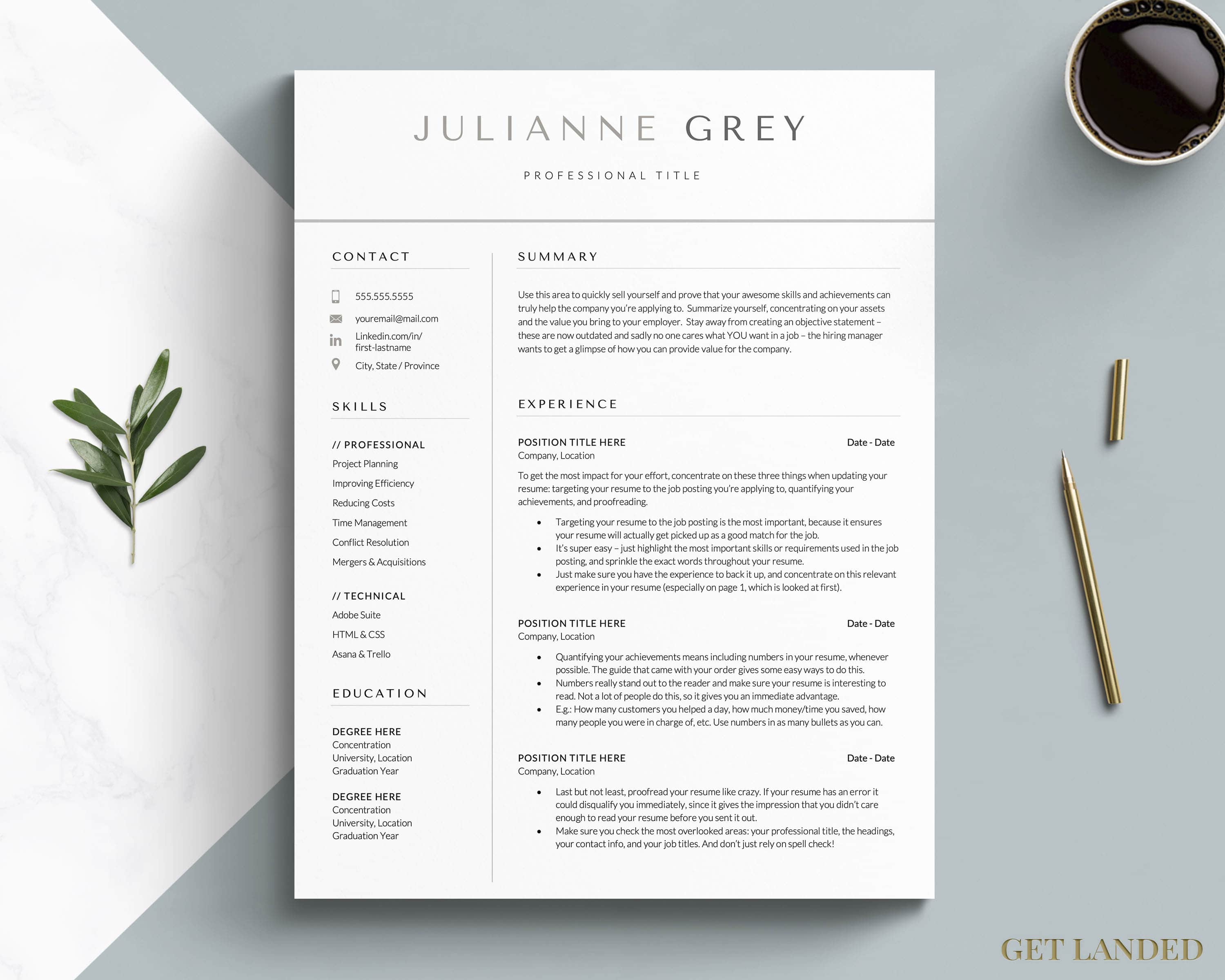
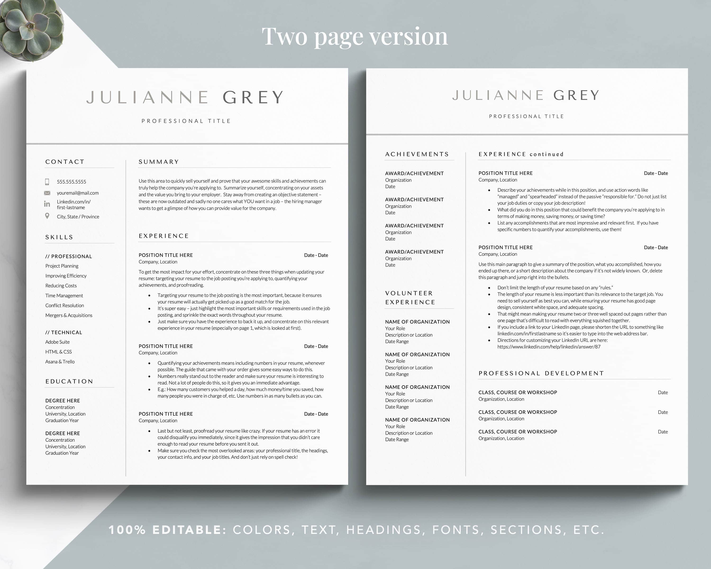
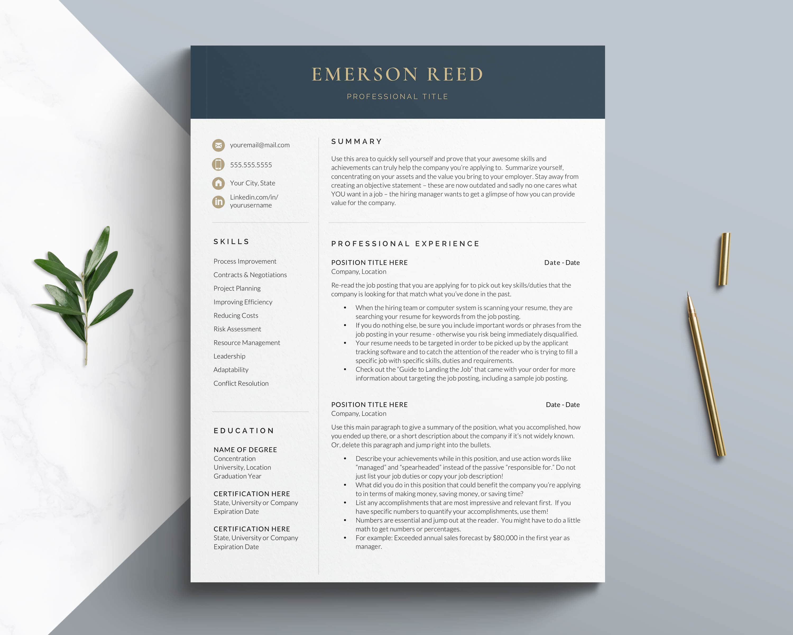
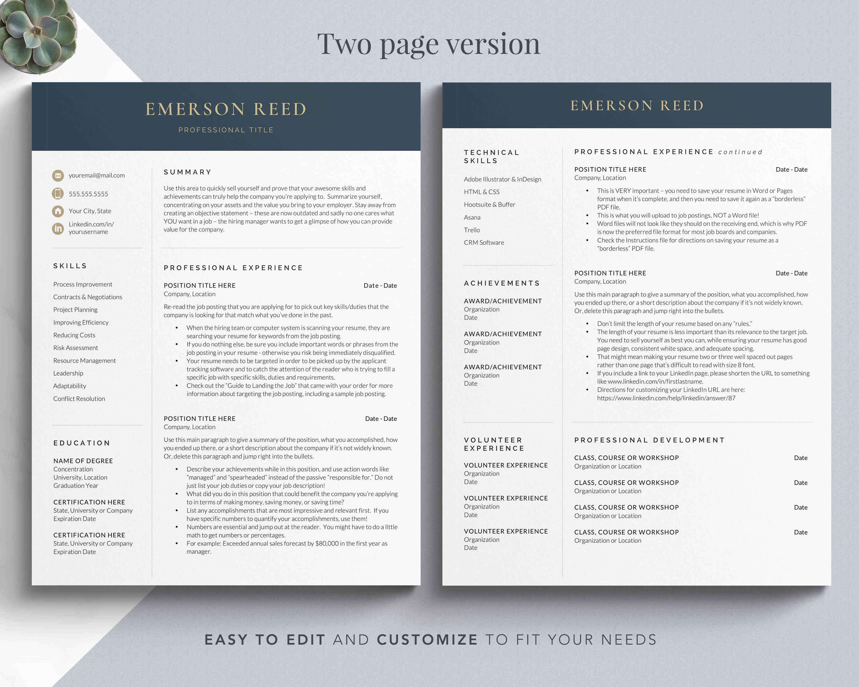
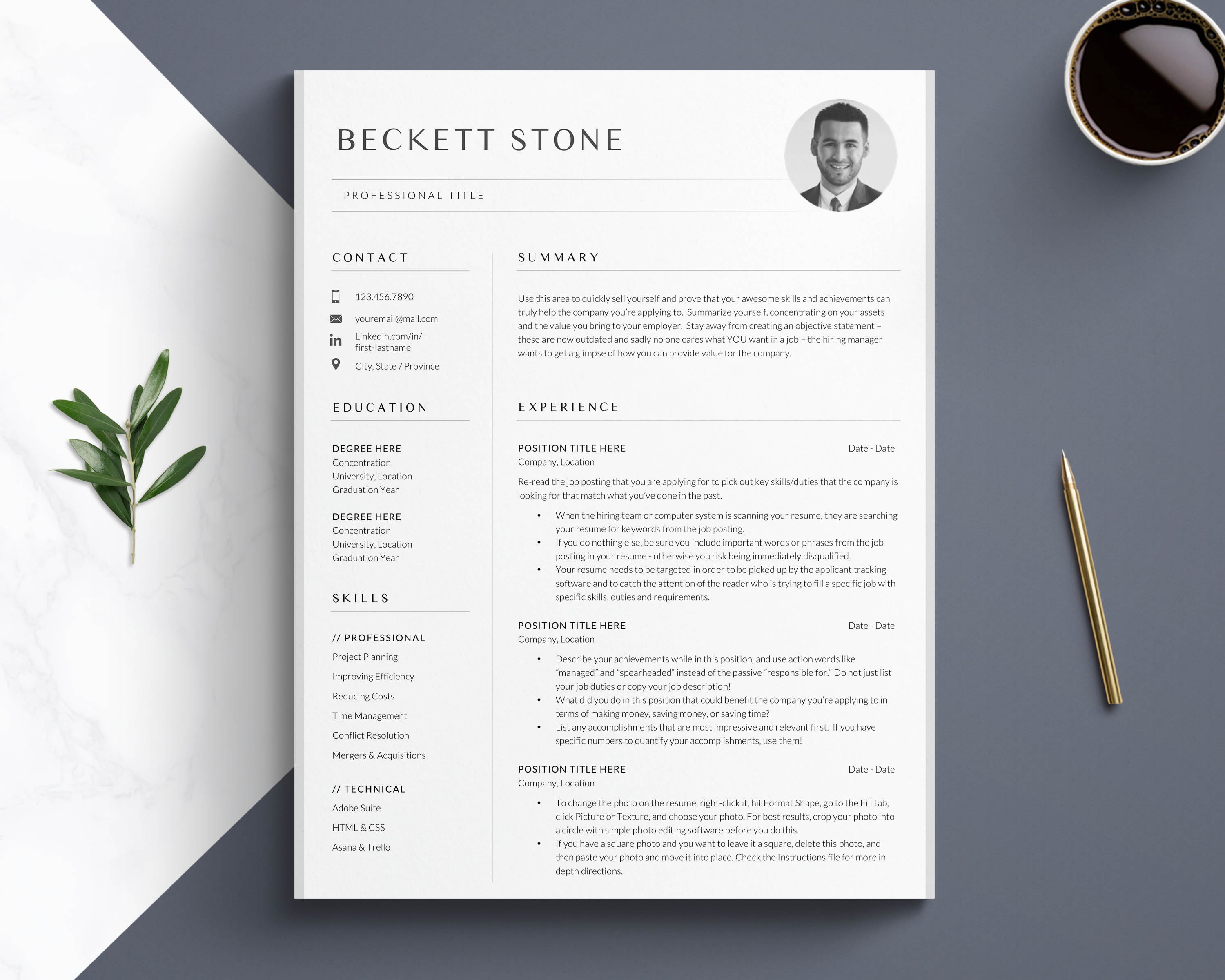
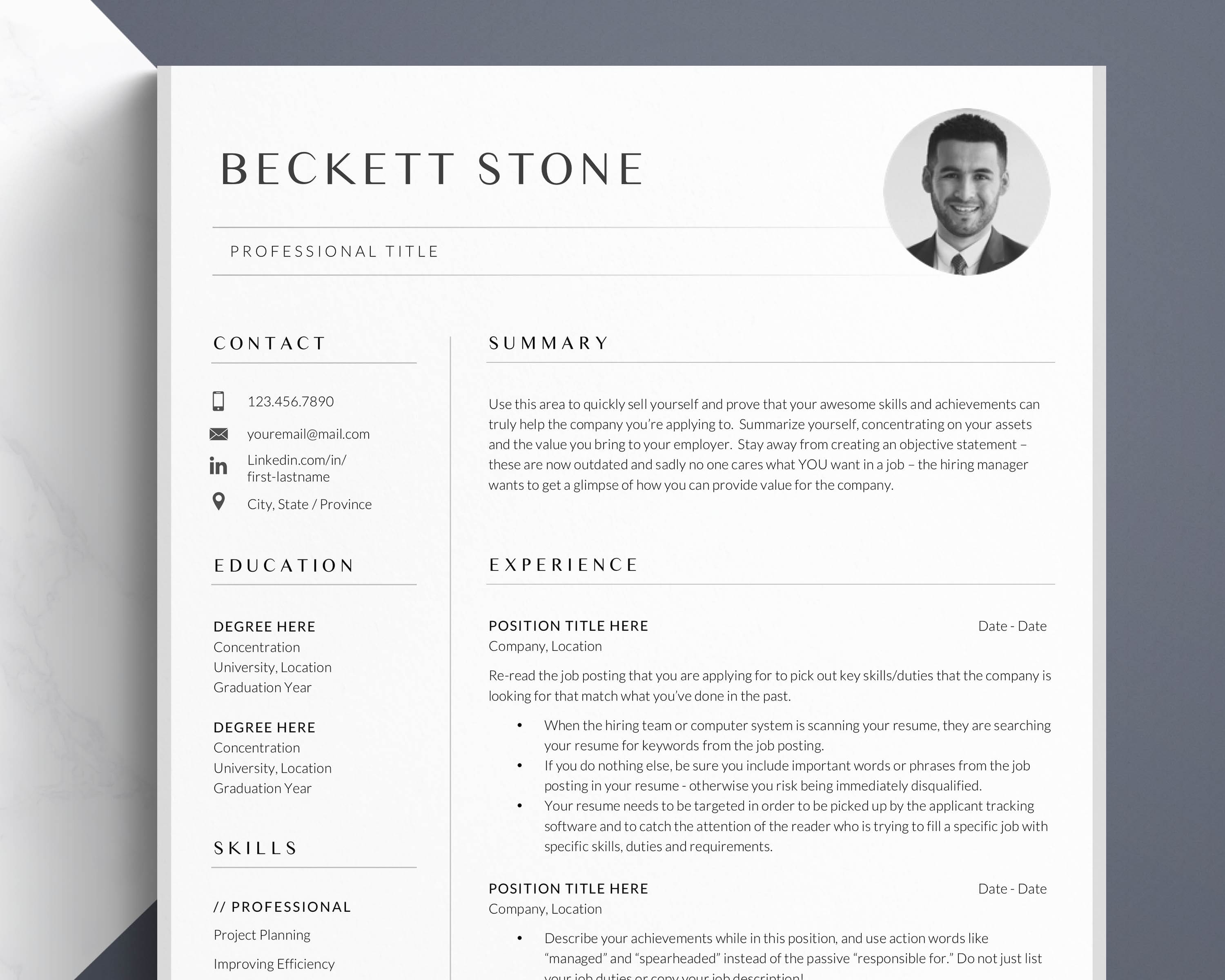
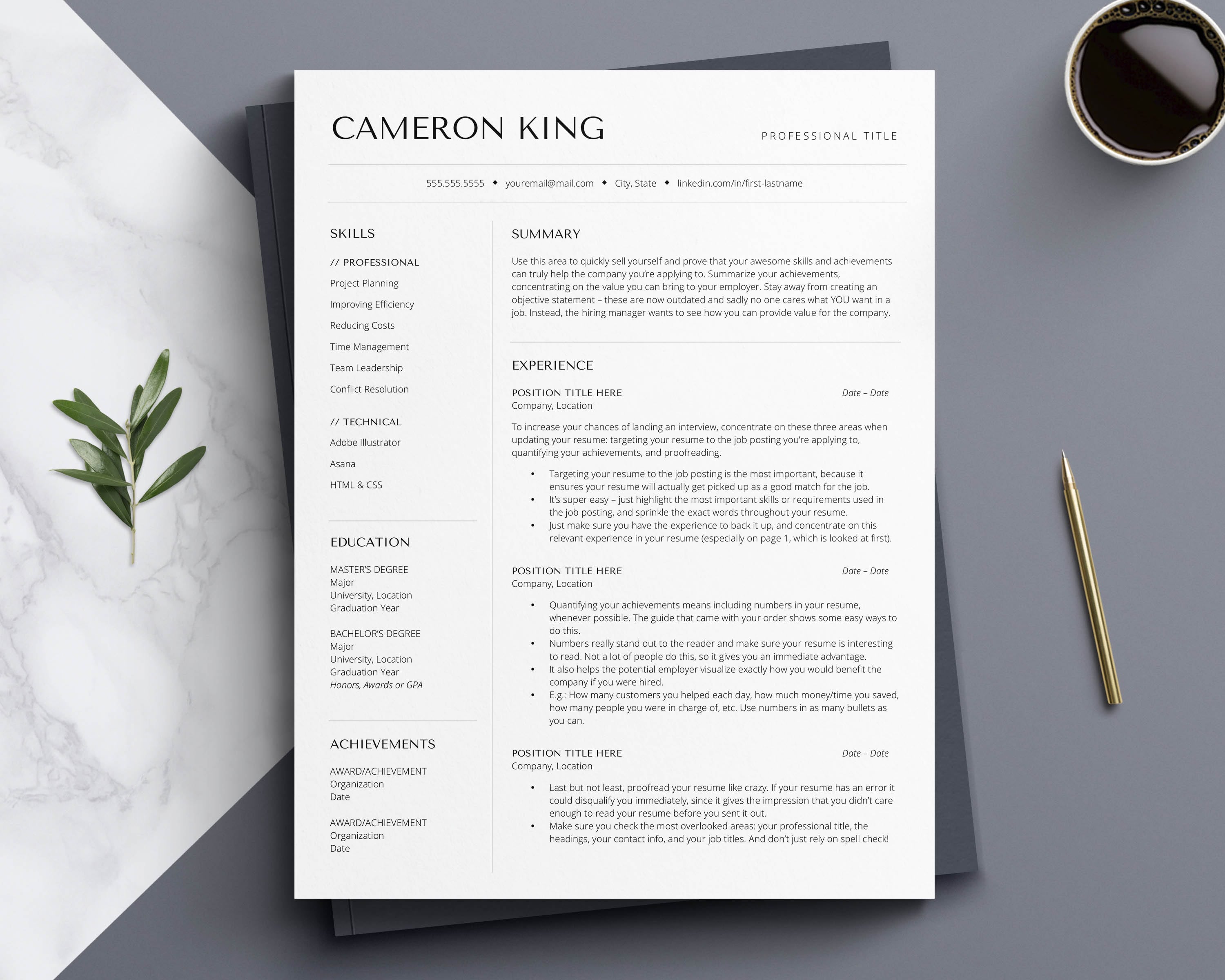
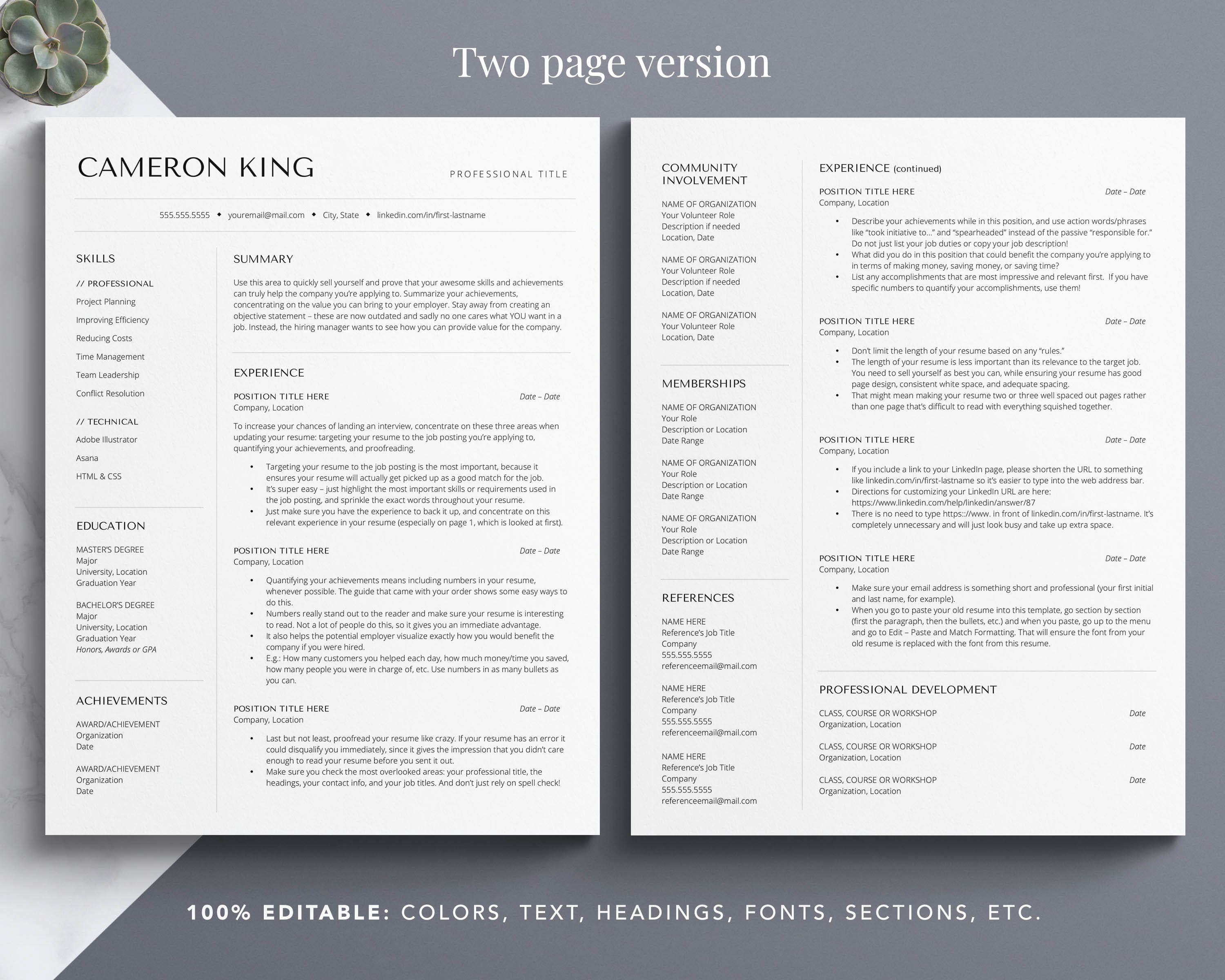
The two column resume template (example below) is becoming more popular, for good reason.
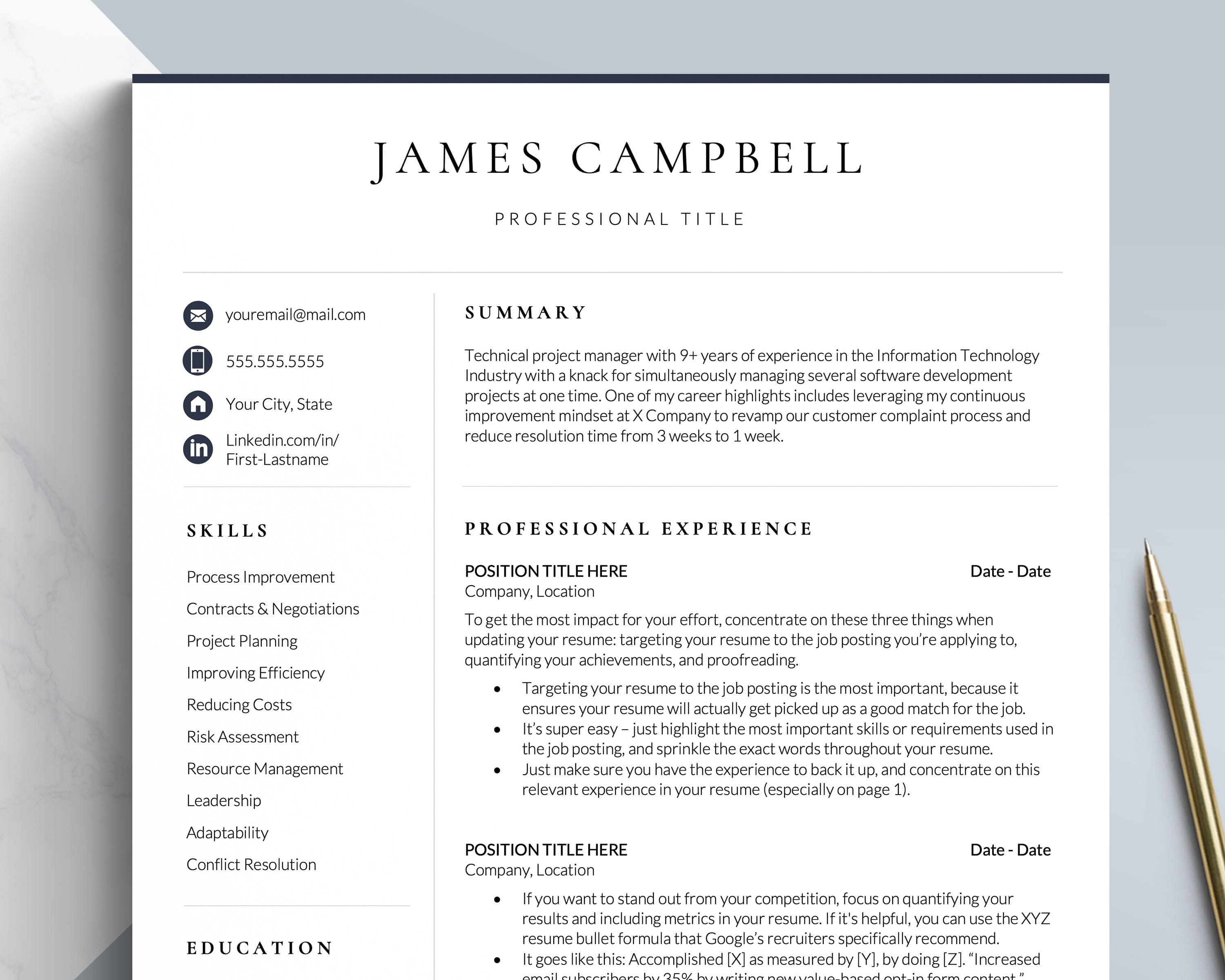
With a two column resume design, page 1 includes your most important and relevant content in an easily scannable format.
In the left column, you can include your Education and Skills, and in the right larger column, you'll include a Professional Profile (or Career Summary) and your Work Experience.
Those are four main areas that the reader wants to see right away, and with a two column resume format they can easily scan for the section they want.
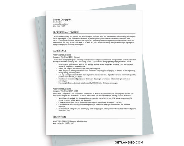
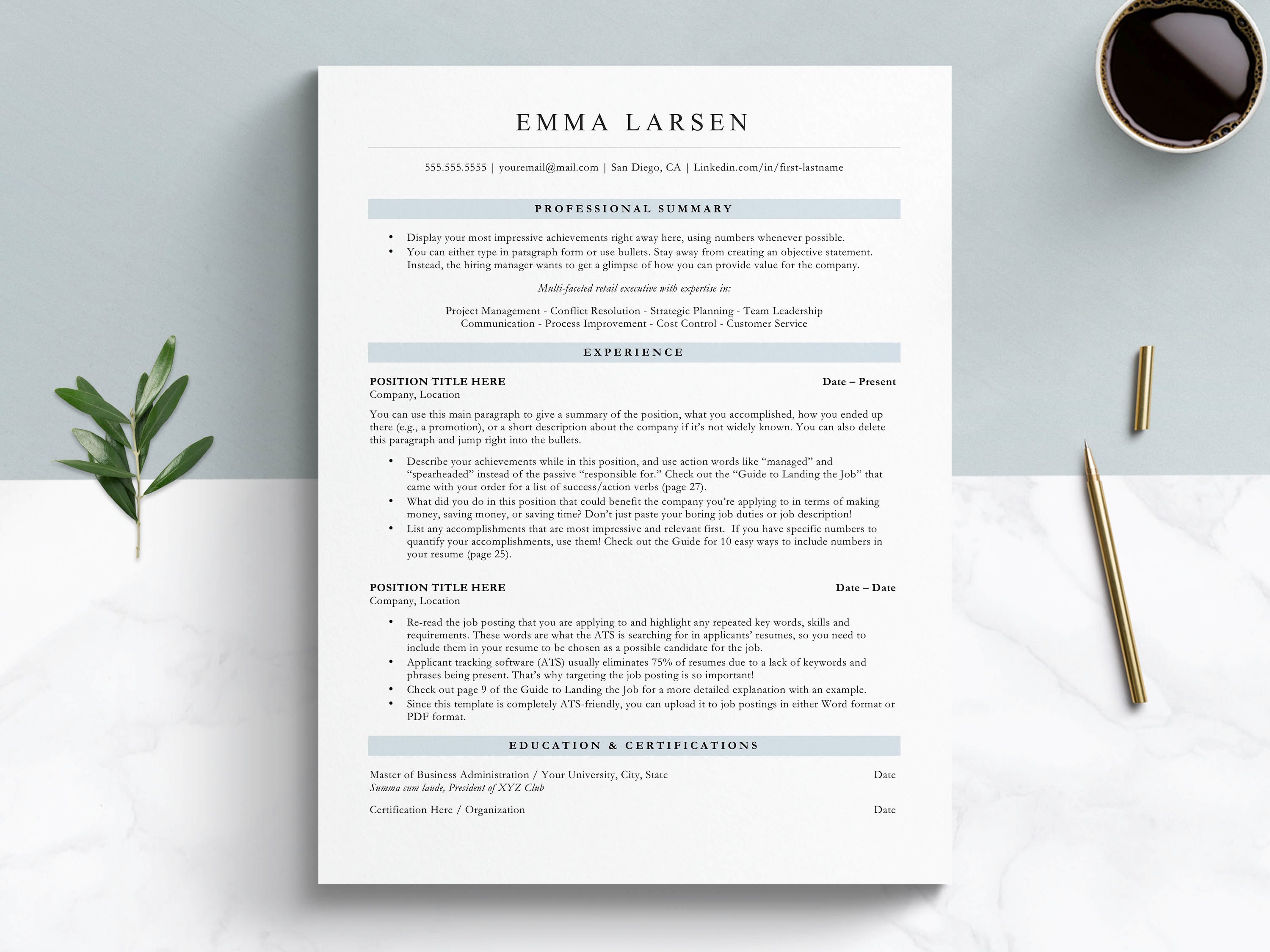
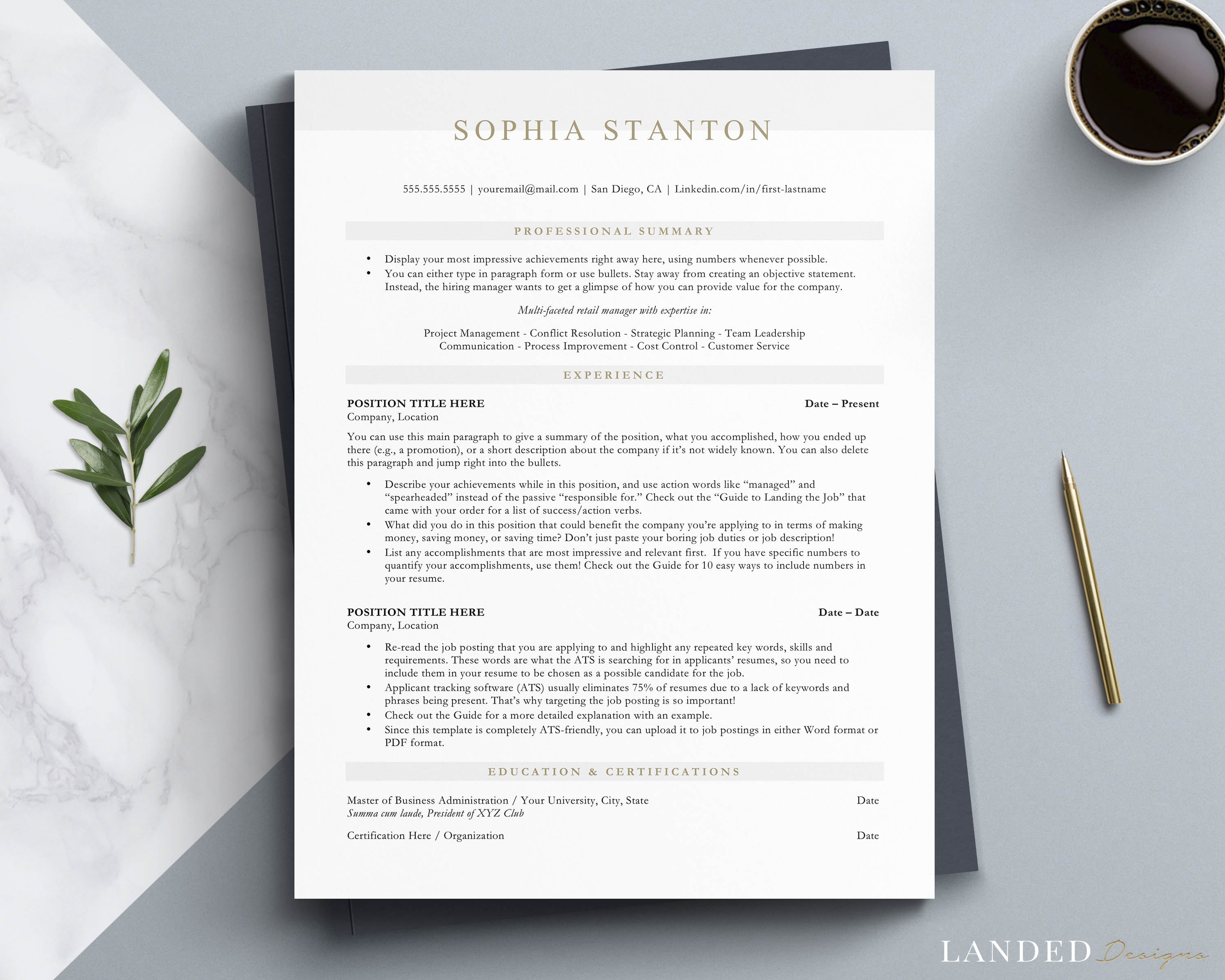
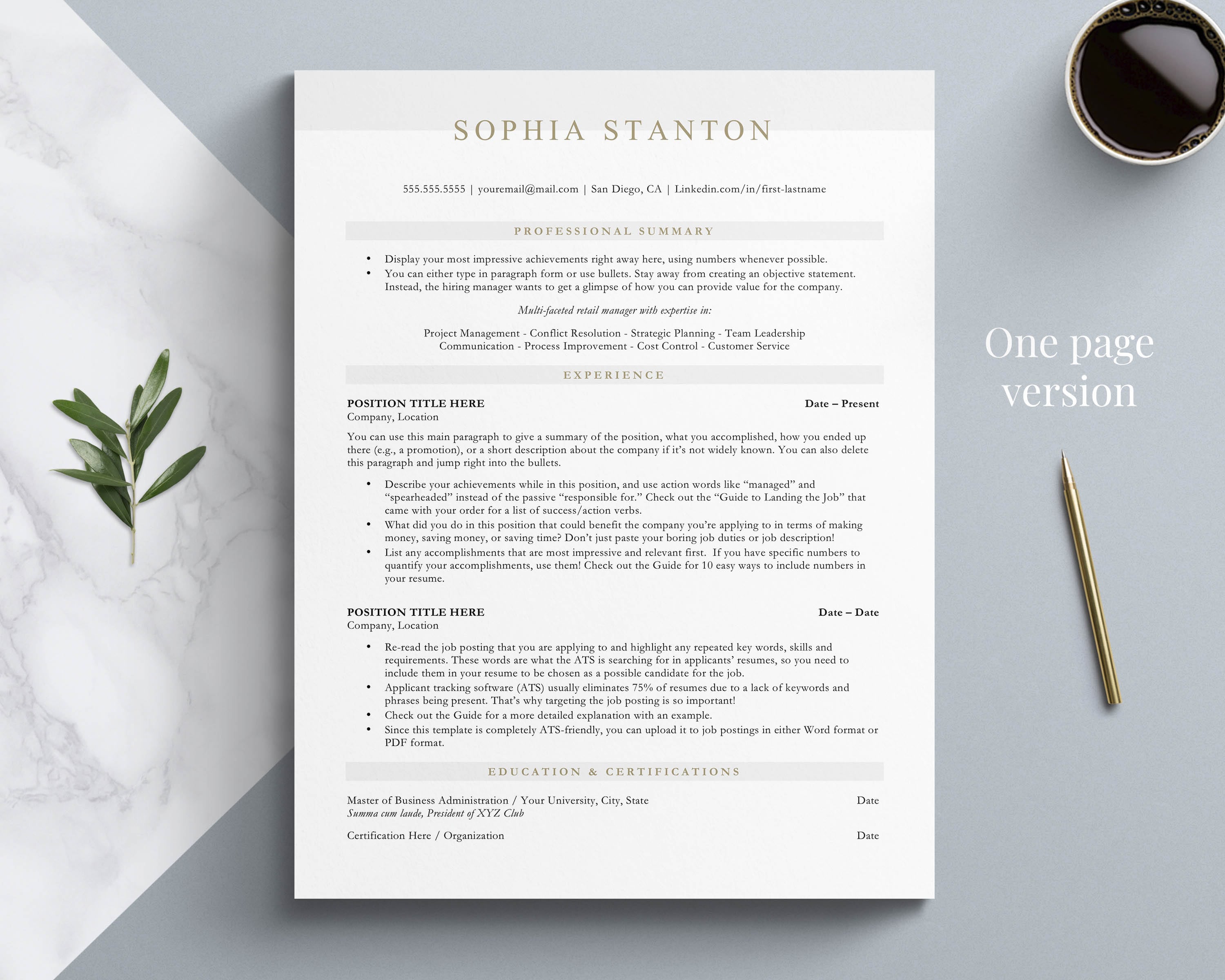
That's not always the case if you use a single or one column resume format, as shown below.
In a 1 column resume, the recruiter will read from top to bottom, so you have to decide on the section order in terms of importance and relevance to your target job.
With a 1 column resume, most applicants list their Profile, then Experience, then Education and Skills. But if you do this, Education and Skills usually end up on page 2 after you list all your Experience.
This can be an issue, because some recruiters do not even look at the second page.
If you only have 6 seconds of a recruiter's time, and they can't quickly find the information they want or it's hidden on page 2, your resume could be discarded.
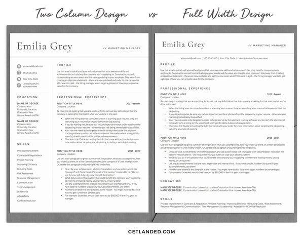
Take a look at this comparison:
Let's be honest - both look great, thanks to some styling tricks and unique fonts (both templates can be found here).
But let's take a closer look.
In the resume on the left, everything is well spaced out, easy to read, with enough white space to make it easy on the eyes.
And, you can easily find whichever section you want to read first.
In the 1 column resume on the right, your eyes will scan it in the order it's given, and all you see is text. There really isn't enough room for many unique elements or to create lines to separate the areas, while still fitting everything onto one page.
Which is easier to read, a 1 or 2 column resume?
Let's compare the Skills section in both resumes as an example.
I find the Skills section especially hard to pick out particular skills in the one column resume format, as compared to the two-column resume format where there is plenty of space in between each entry and you can read them from top to bottom.
White space in a resume is VERY important. A crammed, hard to read resume might not even get read.
(If you were a recruiter trying to get through dozens of resumes a day, would you bother straining your eyes trying to read a resume, or would you *maybe* save it for later and skip to the next?)
In most cases, unless your resume is very text heavy with 3+ lines per bullet in your experience section, a 2 column resume design is the best option.
Design differences
Another downside to the one column resume format is that you have to keep the name header and contact info as small as possible in order to fit your most important and targeted information on page 1.
Not a huge deal, BUT design-wise, the name styling and contact icons are part of what makes your resume stand out in a two column resume design.
These days, even though content is always king, your resume's design should be more modern, rather than the old traditional resume style.
A full-width resume without any design elements that stand out will not get you the attention you need to be competitive in today's job market.
This is exactly why I concentrate on creating two column resume templates that include the most important sections on page 1.
Because your first goal is to STAND OUT and make an incredible first impression, so that the reader then spends more time reading the actual resume content (your achievements, skills, experience).
Content is king. That's why each of my resume templates comes with a free 50+ page resume guide to help you create a resume full of achievements and increase your chances of landing a job, faster.
Can the ATS scan a two column resume template?
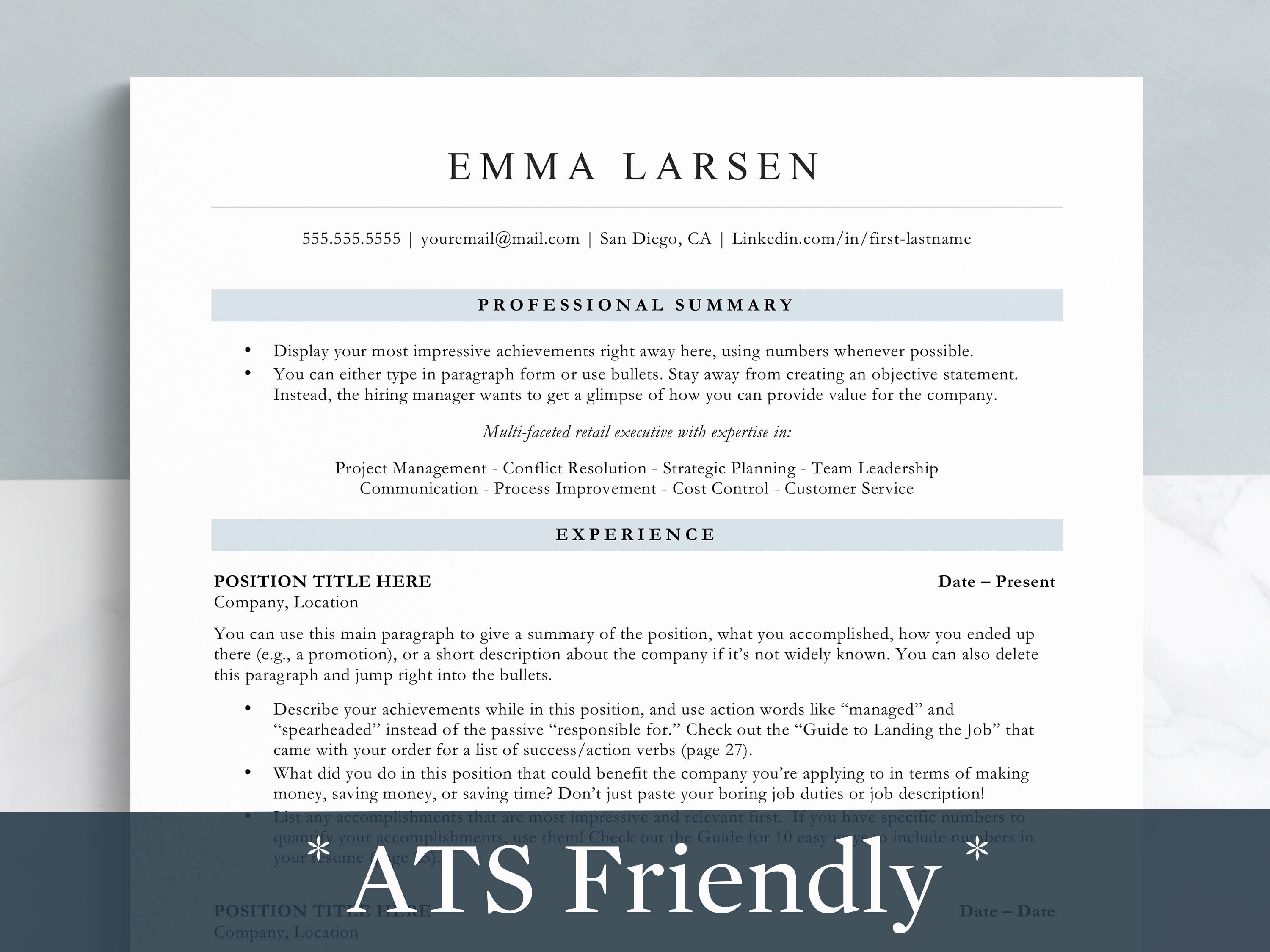
You can stop worrying now: the Applicant Tracking Systems (ATS) can easily read a two column resume template, especially if you upload it in PDF format.
As a bonus, my resume templates follow a few self imposed ATS rules I've learned along the way, are designed as simply as possible, are tested and tweaked often, and created with feedback from recruiters.
So, you can finally stop worrying about ATS when it comes to design.
When it comes to the ATS, there is one element that you need to concentrate on: targeting your resume to the job postings. Meaning, include keywords from the job posting in your resume.
I talk about this much more in depth, including examples to make it easier, in the writing guide that comes with your order :)
Here's why a two column resume format is the best option for most applicants:
- It immediately stands out during that initial 6 second scan
- It's easy to read and scan for important information
- It has ample white space and pleases the eye
- It enables you to put 4 or more resume sections on the first page, which is impossible with a full width design
- It can easily be scanned by the ATS in PDF format
- Most resumes fit better in a 2 column format
Now go chose resume format you love, write some amazing content with my writing guide to help you, and finally apply to jobs with confidence. :)


